One grid, many possibilities
A 12-column square grid, with which all design elements are aligned, determines the layout principle of all media. The grid applies to digital and analogue media, both for cover and inside pages.
In analogue media, it is always the short format edge that is divided into twelve grid units. The grid begins at the top left of the format margin – format-related “grid remnants” then end up at the bottom or right. In digital media, a 12-column, responsive bootstrap grid is used.
The general layout guidelines apply to all media except for the inside pages of brochures/magazines where the Corporate Cube is omitted and the double page works as a whole (see “Brochures”).
Essentials
- At least two cubes: Corporate Cube and Communication Cube
- A maximum of three cubes: Corporate Cube, Communication Cube, Additional Cube
- All cubes touch on one side.
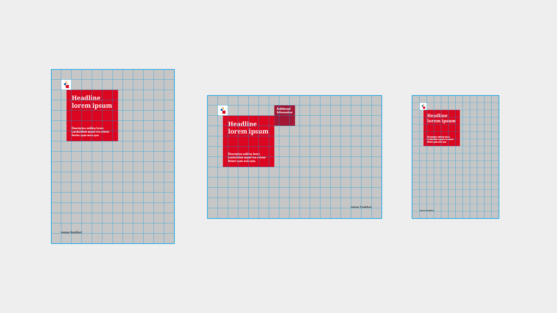
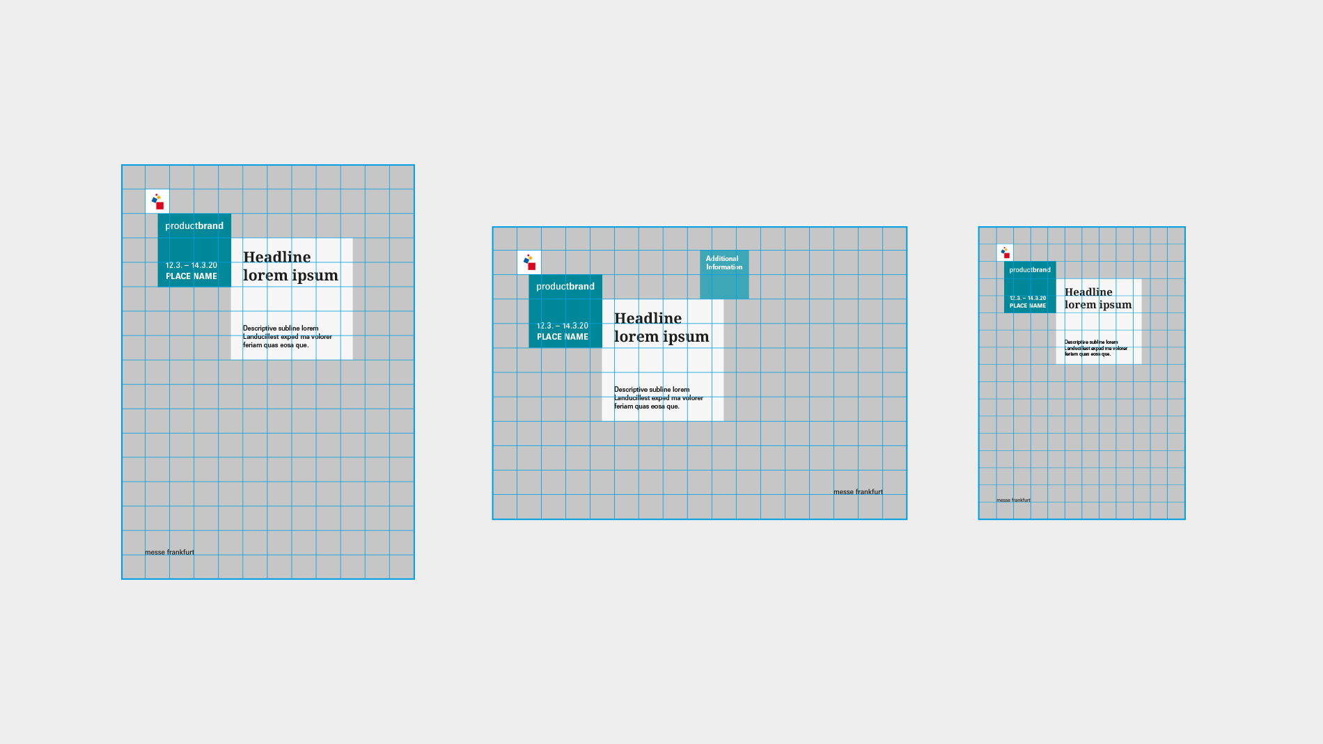
Options
- If it is more suitable for the design of the respective medium, the grid can be placed at a different format corner.
- Although the size/width of the elements is aligned with the grid, they can be moved within the grid.