The brand experience of Messe Frankfurt and its events is not only shaped by marketing communications.
The way it is perceived through personal touchpoints with Messe Frankfurt employees within the scope of the many service offerings also determines the “image” that is created in our customers’ minds.
This brand experience is rounded off perfectly by the time spent at the exhibition grounds and the perceived quality of the visit.
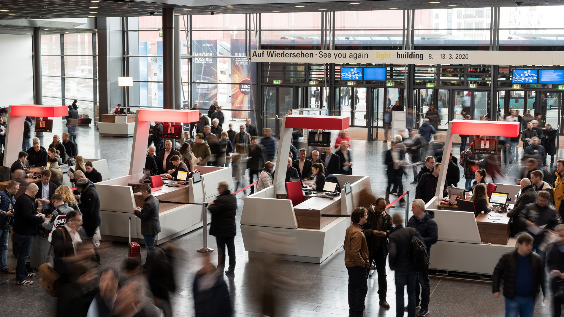
- Quick and easy orientation with the help of our well-designed orientation system or easy-to-locate service counters
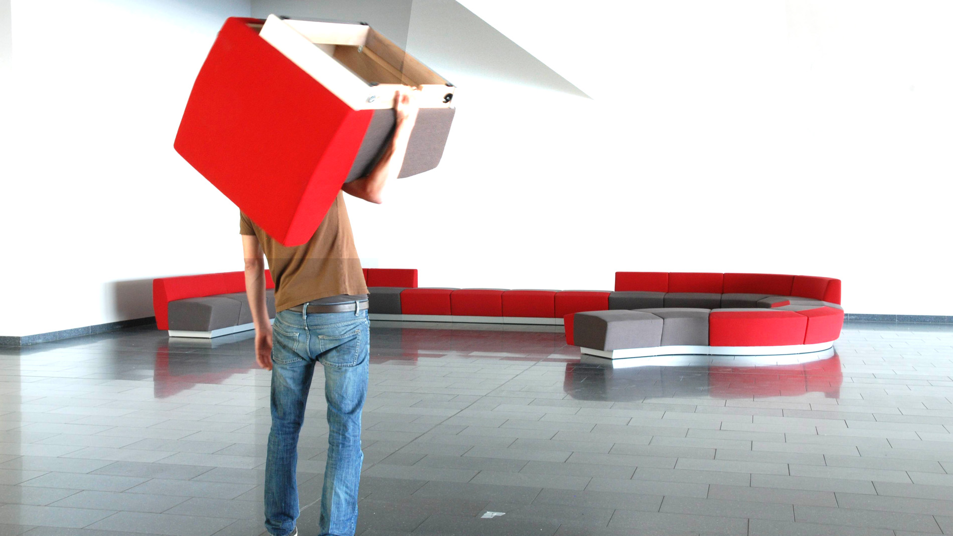
- The possibility to rest for a few minutes on the furniture in the concourses and exhibition halls
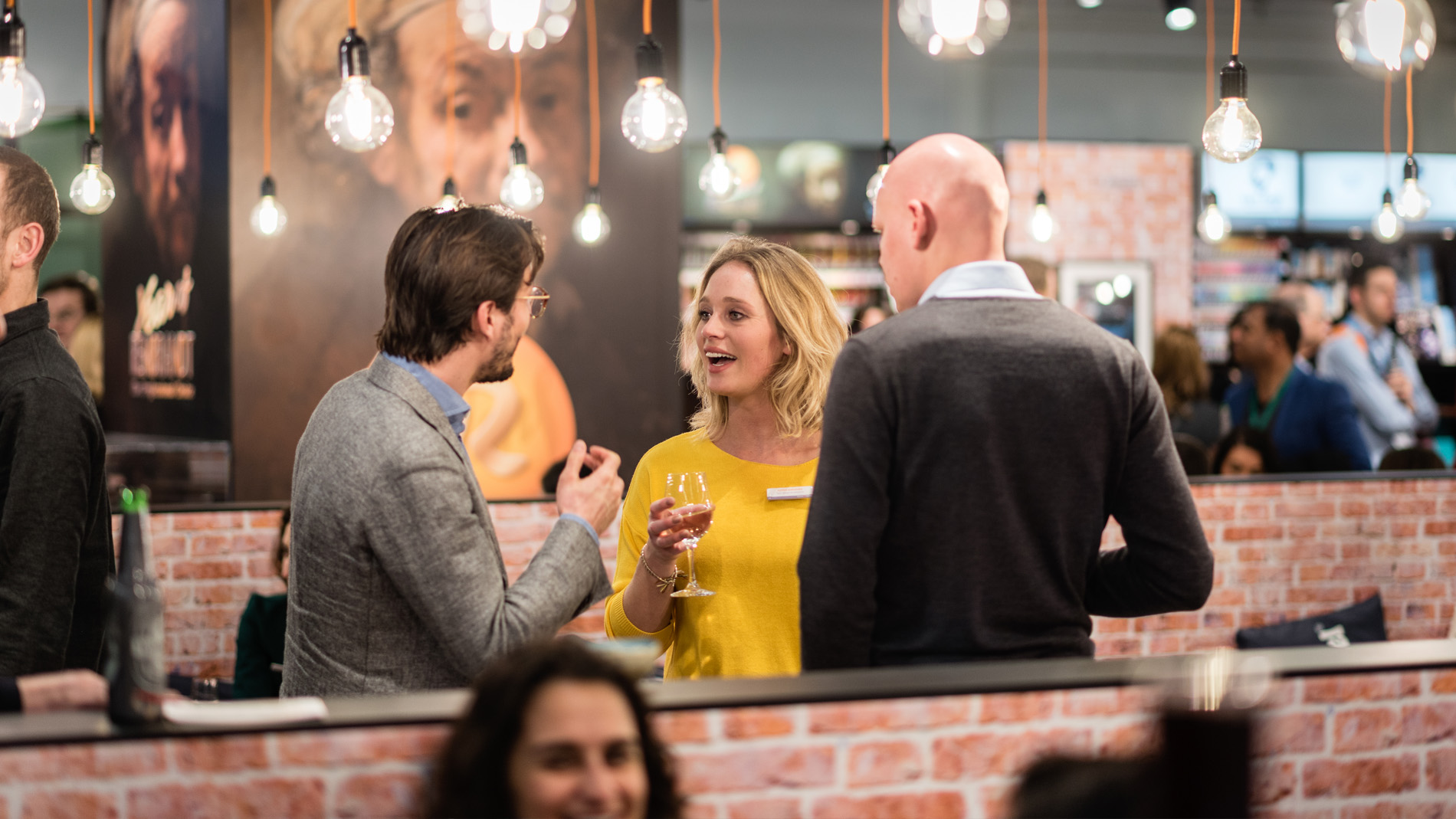
- A well-earned break at one of the high-quality bistros and restaurants
All of these positive experiences play a part in the perception of Messe Frankfurt and its events as reliable, connecting and high-value – and thus as an attractive partner.
Our visual identity: the furniture lends it a tangible look and feel
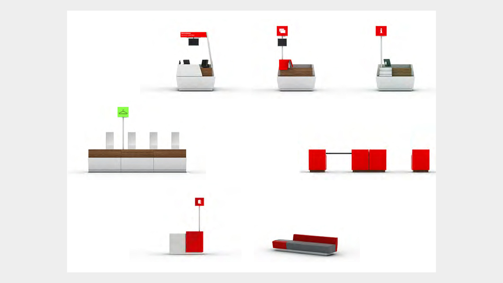
The “Area Seating” underscores the clear visual identity of Messe Frankfurt also in terms of interior design. Together with the counter system, it forms part of the service furnishings. We have guidelines for both, which we will be pleased to send you on request. Throughout the exhibition grounds, the modular rest area furniture “Affair” invites you to rest for a few minutes and recharge your batteries.
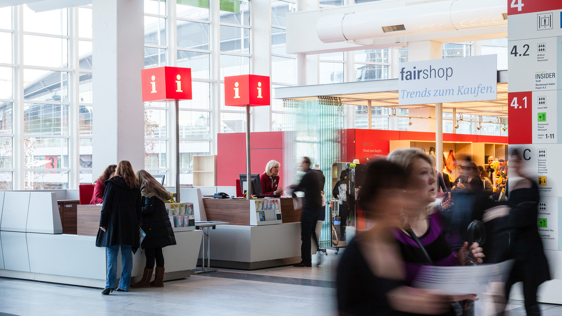
The counter system distinctively characterises our cash desk and information areas; additional elements are used for the high-quality design of our cloakrooms and admission desks, as well as catalogue sales.
Systematic orientation: find your destination with ease
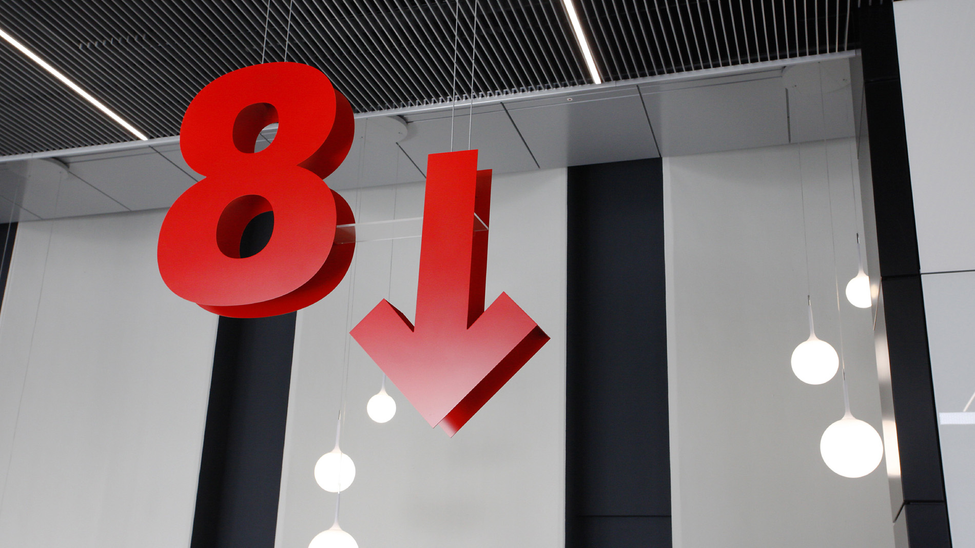
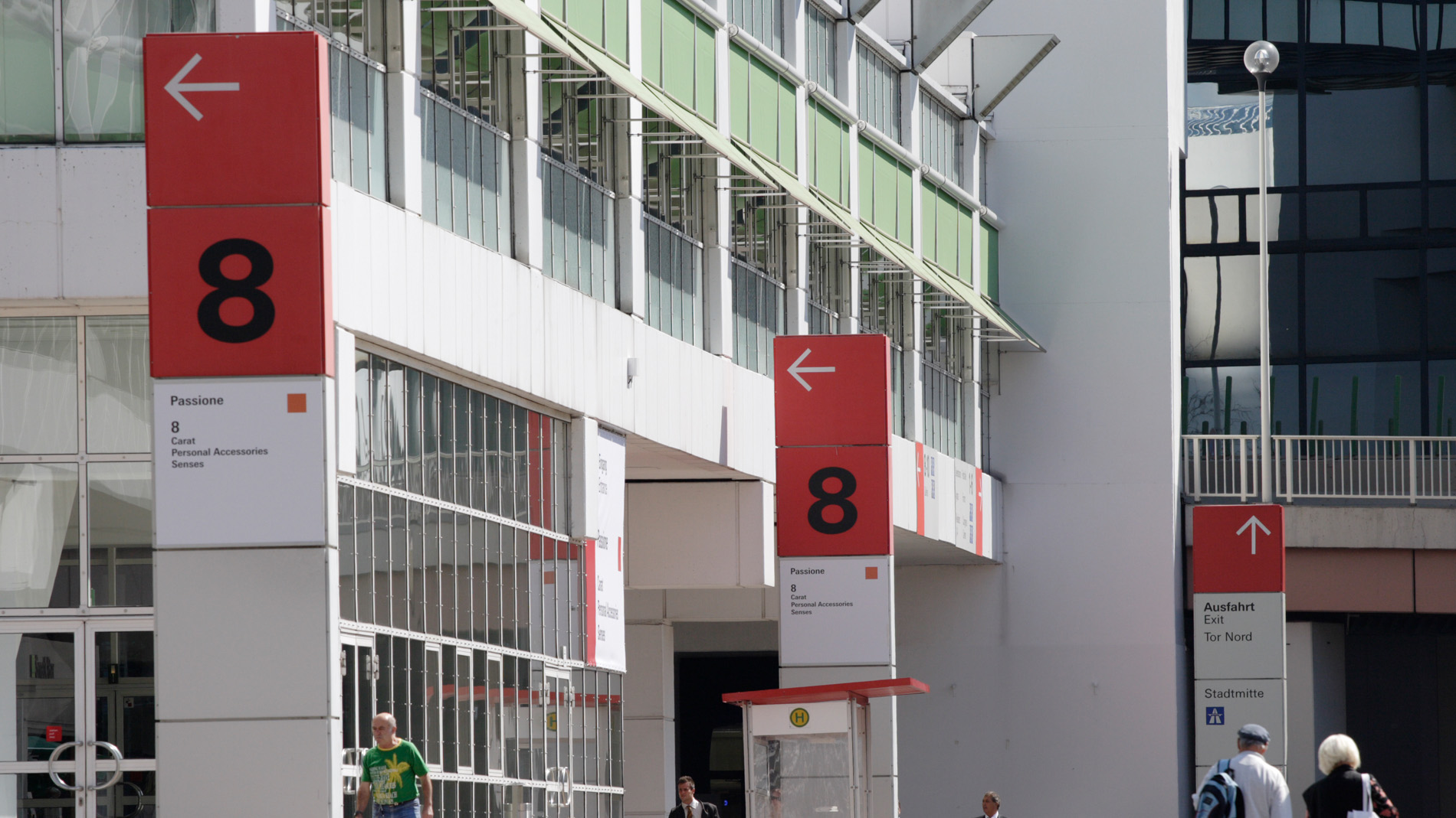
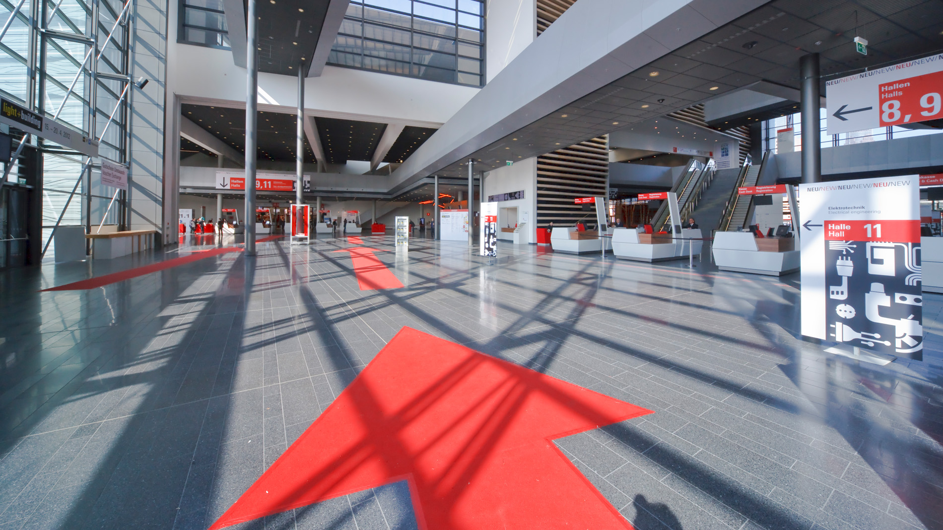
Clear signage and markings make our exhibition grounds quick and easy to navigate for everyone. This not only goes for accessibility to the hall areas, but also to the many service offerings.
Signage system: our city within a city. The dimensions and in many cases award-winning architecture of our exhibition grounds with all indoor and outdoor spaces is impressive. No less fascinating is the associated visitor orientation system (VOS) that was developed especially for this complex site. This guides various different user groups quickly, directly and efficiently to their desired location. We will be pleased to send you our comprehensive guideline on request.
Signage for restaurants and supermarkets: Bon appetit! Our high-quality and diverse range of hospitality outlets and supermarkets can be identified across the exhibition grounds with the help of a modular branding system. Guided by a common culinary theme, visitors can find their way to all the gastronomic establishments across the exhibition grounds – thanks to internationally understandable symbols. To ensure sufficient contrast to the colourful exhibitor and event communications, this branding is designed completely in black and white.
In our guideline, you will find everything you need to know about flags, display boards, digital menus or signage – please feel free to contact us.
