By virtue of its flexibility, the cube system offers many advantages for the design for all media.
Each cube has a defined function; the arrangement can vary depending on the layout. The system is therefore very flexible, depending on the key visual, medium format and type of information. All relevant information can be staged in the cubes.
Since the cubes stand for encounters, they always appear in combination of at least two different cubes, one of which is always the Corporate Cube.
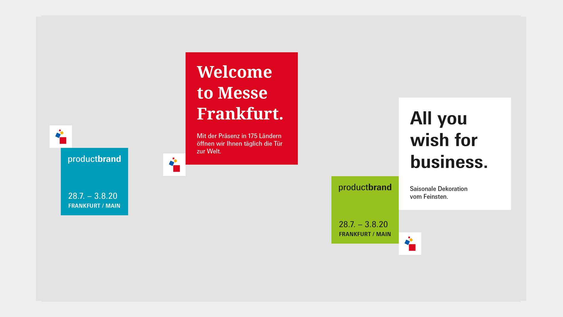
Corporate Cube
The Messe Frankfurt symbol is always placed in the Corporate Cube – in colour on a white background. The Corporate Cube is used on all applications across different media – both in corporate and event communications. It never stands alone, but always in combination with other cubes. Depending on the medium and format, the Corporate Cube may have one side at maximum in the bleed. On a white background the Corporate Cube is depicted with a grey outline.
Communication Cube
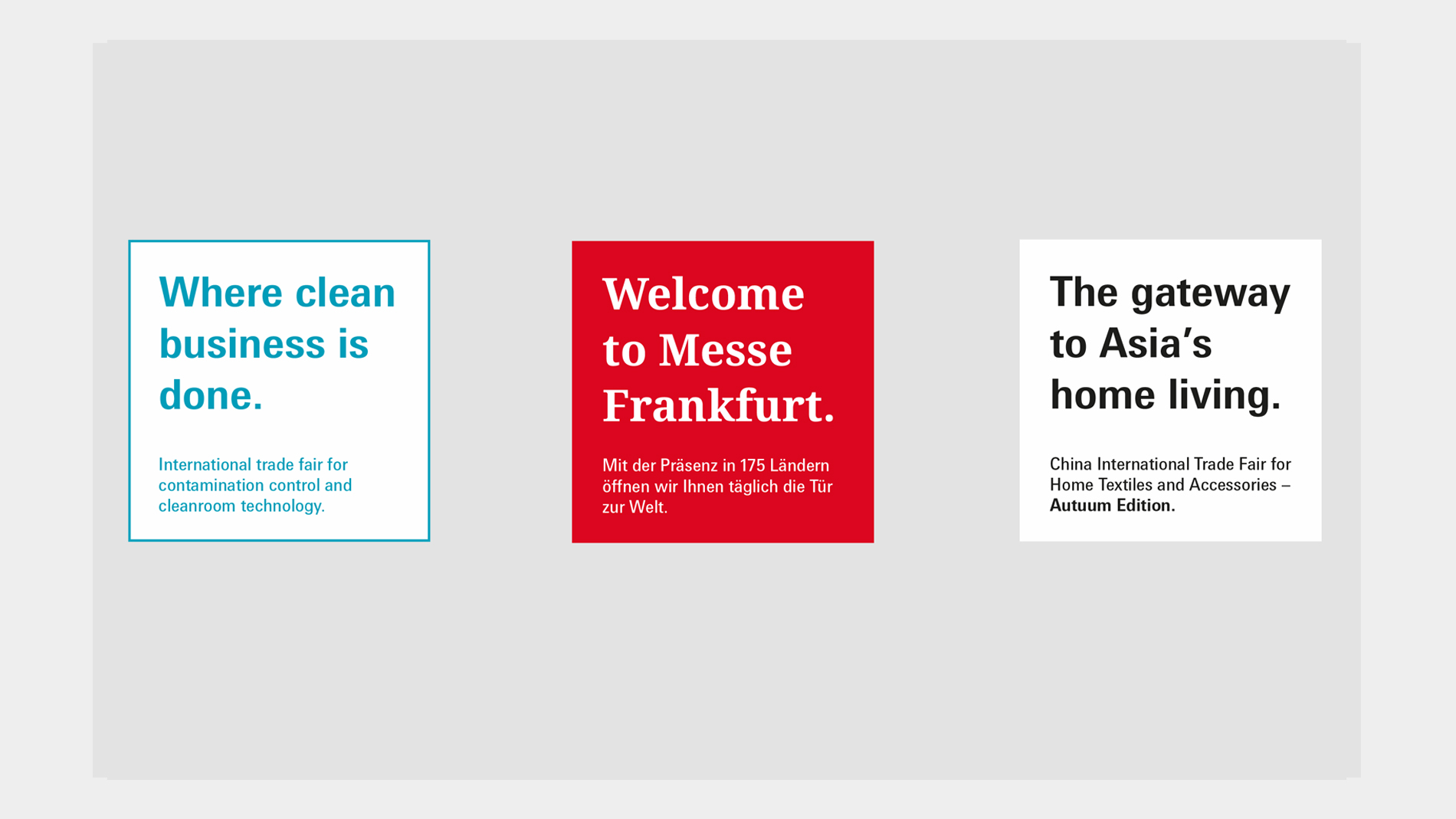
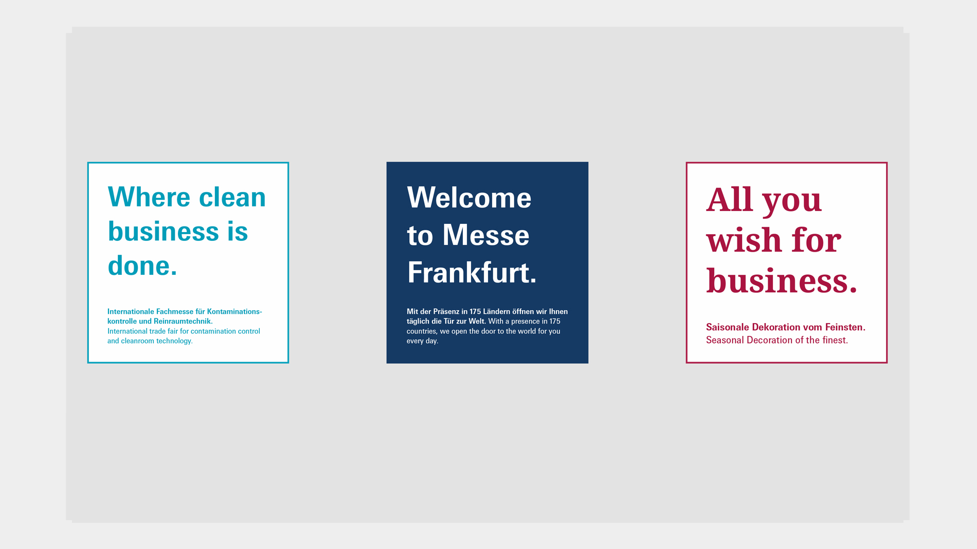
The Communication Cube is the largest and therefore most prominent cube. It contains the key message – the reason why – and is used in all media.
Typefaces: The key message can be set in both corporate typefaces: as a sans serif typeface, the Messe Univers typeface or alternatively the licence-free Roboto typeface can be used. Noto Sans is available for Asian and Arabic texts. The Noto Serif typeface can be used as a serif typeface.
Colour: In corporate communications, the Communication Cube is in the corporate colours. In event communications, the Communication Cube is white. Alternatively, it can also take up the colour of the key visual. The Communication Cube always has a slight translucency (we recommend an opacity of 85%).
Two languages: For media in two languages, only the sub-line of the Communication Cube is translated into the respective national language. The key message is only in English.
Product Cube
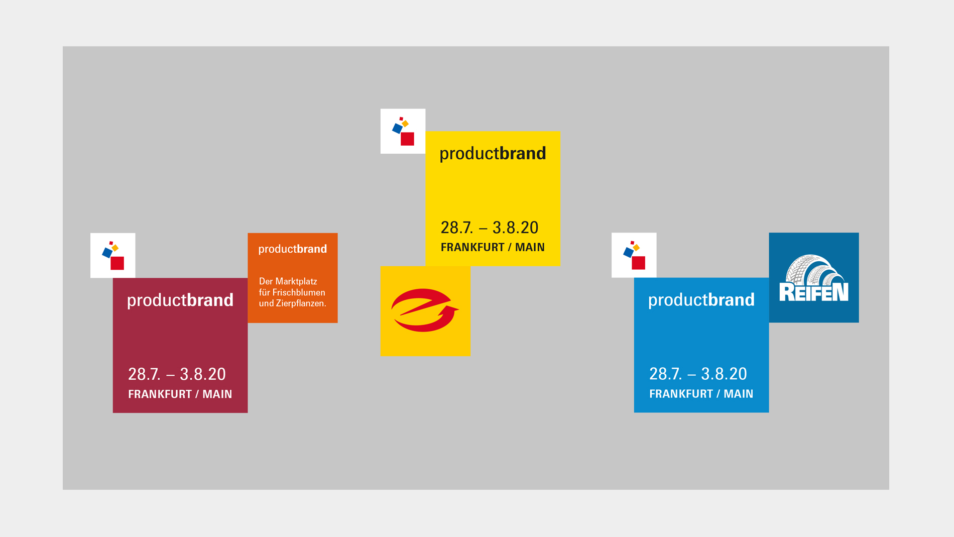
Event brand logotypes are placed in the Product Cube – in white or black on the primary colour of the event brand. The Product Cube is not used for corporate communications.
The Product Cube is used on the cover and ad pages of all analogue media. Only one Product Cube is used per layout. This is always in direct correlation to the Corporate Cube.
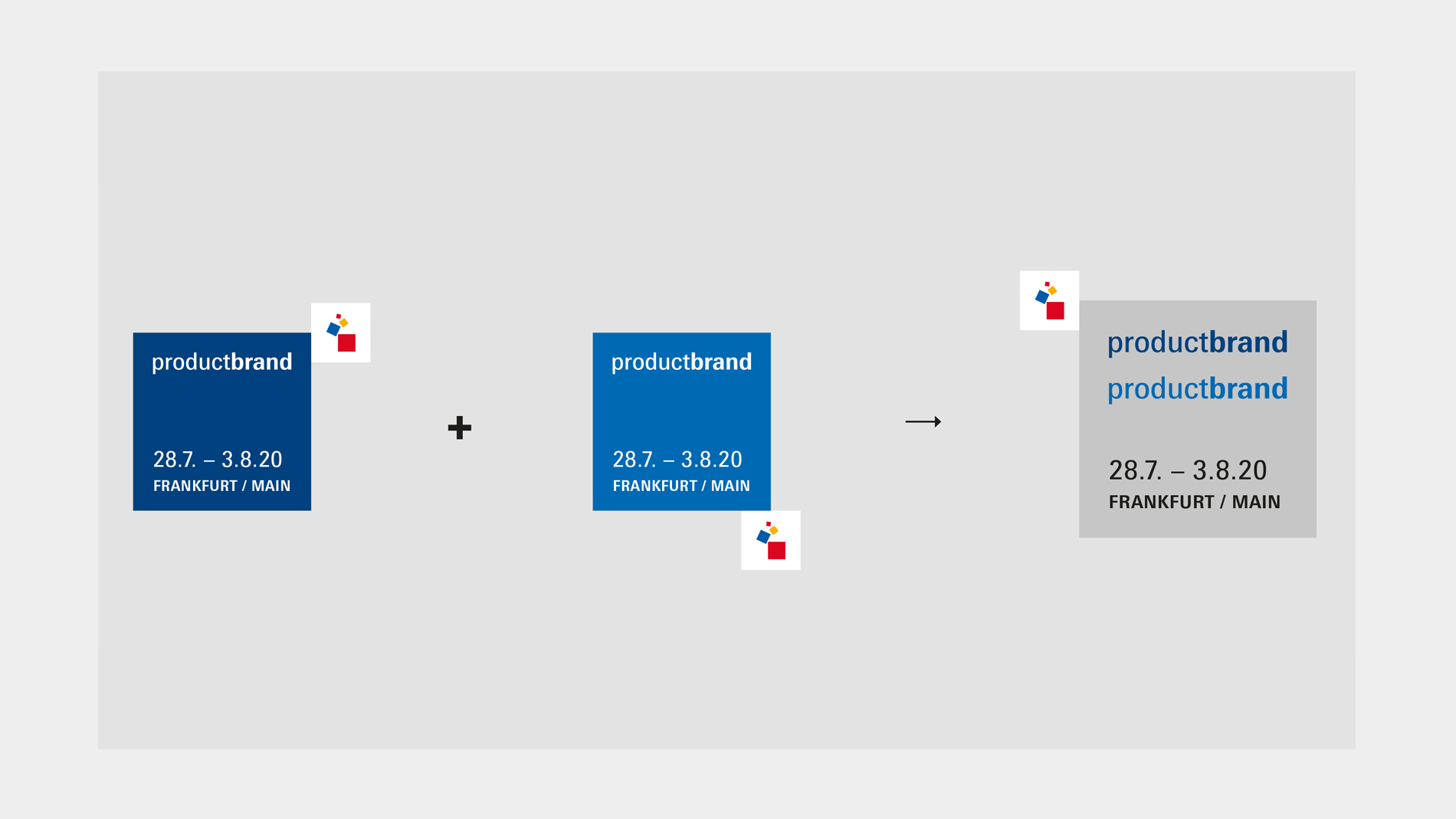
A neutral design is used for the joint communication of two parallel events. Both logotypes are set in their respective primary colour in a single grey Product Cube.
The logotypes are set flush left in the upper part of the Product Cube. The date and location indicator are shown in the lower part. Here the months are set as digits and the respective year with just two digits. Logotypes with trademark protection that includes the location indicator are placed together with the location indicator in the upper part. The location indicator below the date is then omitted accordingly.
Two-colour event brands use the stronger of the two colours as the primary colour. The other colour is only used as a secondary colour. The colouring of the Product Cube should be clearly differentiated from the key visual of the event brand.
Partner Cube
Partners are placed in a separate cube. A distinction is made between organiser partners and event partners.
The Partner Cube is not used for corporate communications.
Partner Cube (organisers): Partner Cubes for organisers are in direct correlation to the Corporate Cube. The logo of the organiser partner is set in colour on white. This Partner Cube is at most as large as the Corporate Cube. A maximum of two Partner Cubes (organisers) may be used together. From four equal organisers (incl. Messe Frankfurt), a special solution must be agreed with department HS42 – Corporate Branding & Marketing (e.g. a white footer bar with logo, see templates for advertisements, brochures, etc.).
Partner Cube (events): Partner Cubes for events are in direct correlation to the Product Cube. The logo of the event partner is set in colour, white or black on the secondary colour of the event. A maximum of two Partner Cubes may be used together. From three equal events, a special solution must be agreed with department HS42 – Corporate Branding & Marketing (e.g. a white footer bar with logo, see above).
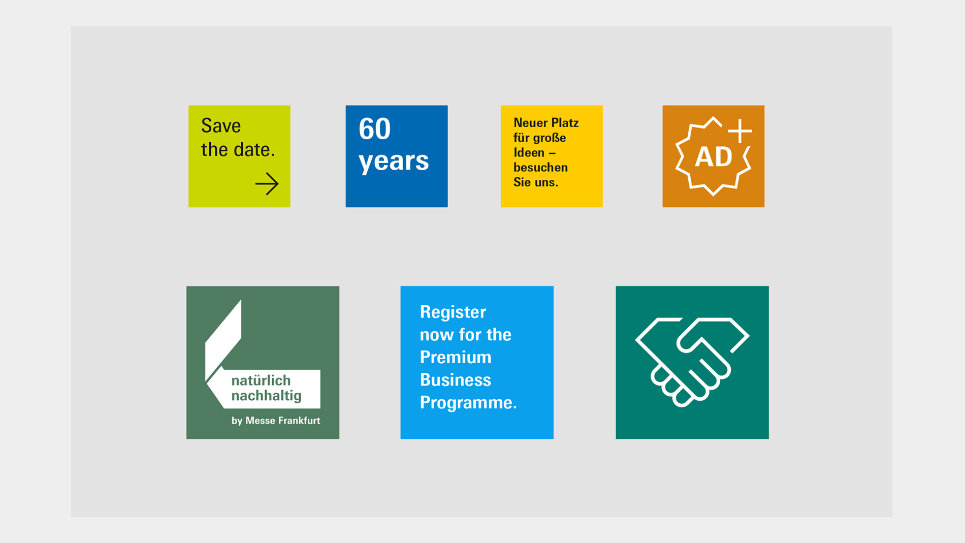
Additional Cube
The Additional Cube contains supplementary temporary information, such as a call-to-action, icons, campaign logos, QR codes or anniversaries. It is always smaller than the Product and/or Communication Cube.
The Additional Cube is designed without translucency in the respective accent colour. The contents are in black or white depending on the contrast to the accent colour.