Corporate brand adaptation to modern requirements
Of course, digital communication also influences the visual identity: small smartphone displays have substantially changed the requirements and above all demand a high degree of flexibility in terms of positioning the elements.
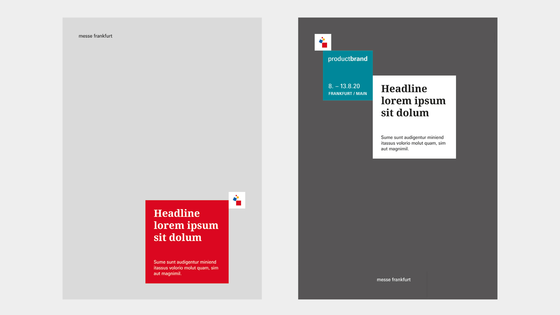
Consequently, in future the Messe Frankfurt symbol (squares) and the logotype (name) will be placed separately in the layout. This allows them to be displayed larger, thus meeting digital requirements much better than the previous wide-running symbol/logotype.
This flexibility is an advantage particularly when placing them on key visuals or background images – the elements can simply be placed where the best visibility is achieved.
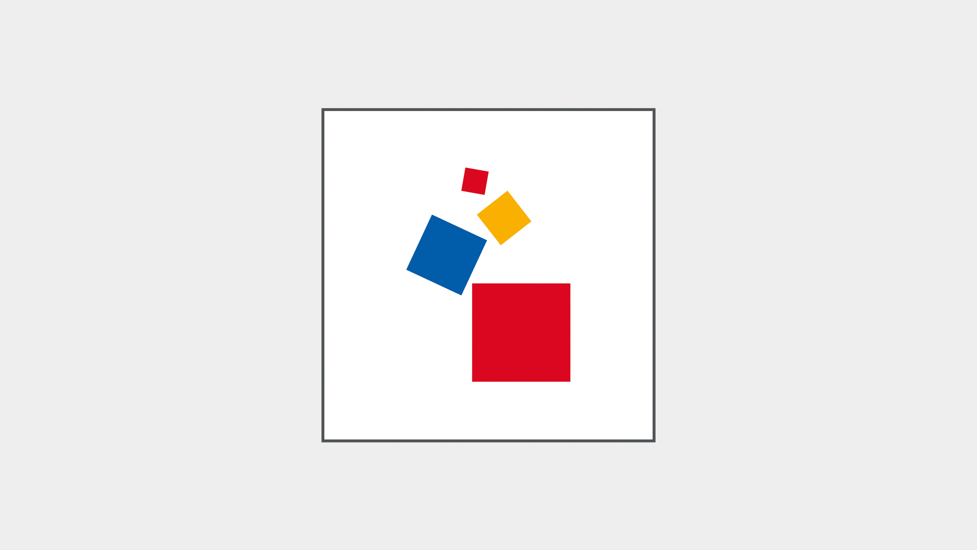
Messe Frankfurt symbol
The Messe Frankfurt symbol is always placed in the Corporate Cube, in colour on a white background. The Corporate Cube is used on all applications across different media – both in corporate and event communications. In event communications, the Corporate Cube is always positioned directly next to the Product Cube.
“Messe Frankfurt” logotype
The Messe Frankfurt logotype can be placed in the layout separated from the symbol. As a result it is flexible and can be used on almost all media and formats. On extreme formats it can even be dispensed with for space reasons.
Event brand logotypes
Event brand logotypes are placed in the Product Cube, which has the primary colour of the event. The interplay between the logotype and the coloured Product Cube ensures a prominent coding on all media.
With respect to size, the logotype should be placed in the cube in such a way that optimum legibility is guaranteed. If necessary, a very long logotype can be split. If you are considering doing this, please check first with your legal department to ensure you are not infringing any trademark protection rights.