The idea behind Messe Frankfurt’s umbrella brand strategy is to develop a uniform corporate design for the umbrella brand and all brands subsumed under it. The look and feel of all brands is thus visually perceived as being consistent and as belonging to the company, and consequently they mutually strengthen each other.
The basis for this shared visual identity are the so-called basic elements: logos, defined typefaces and colours, a defined picture and video style, infographics and illustration style are combined together in a unique way through the defined design principle.
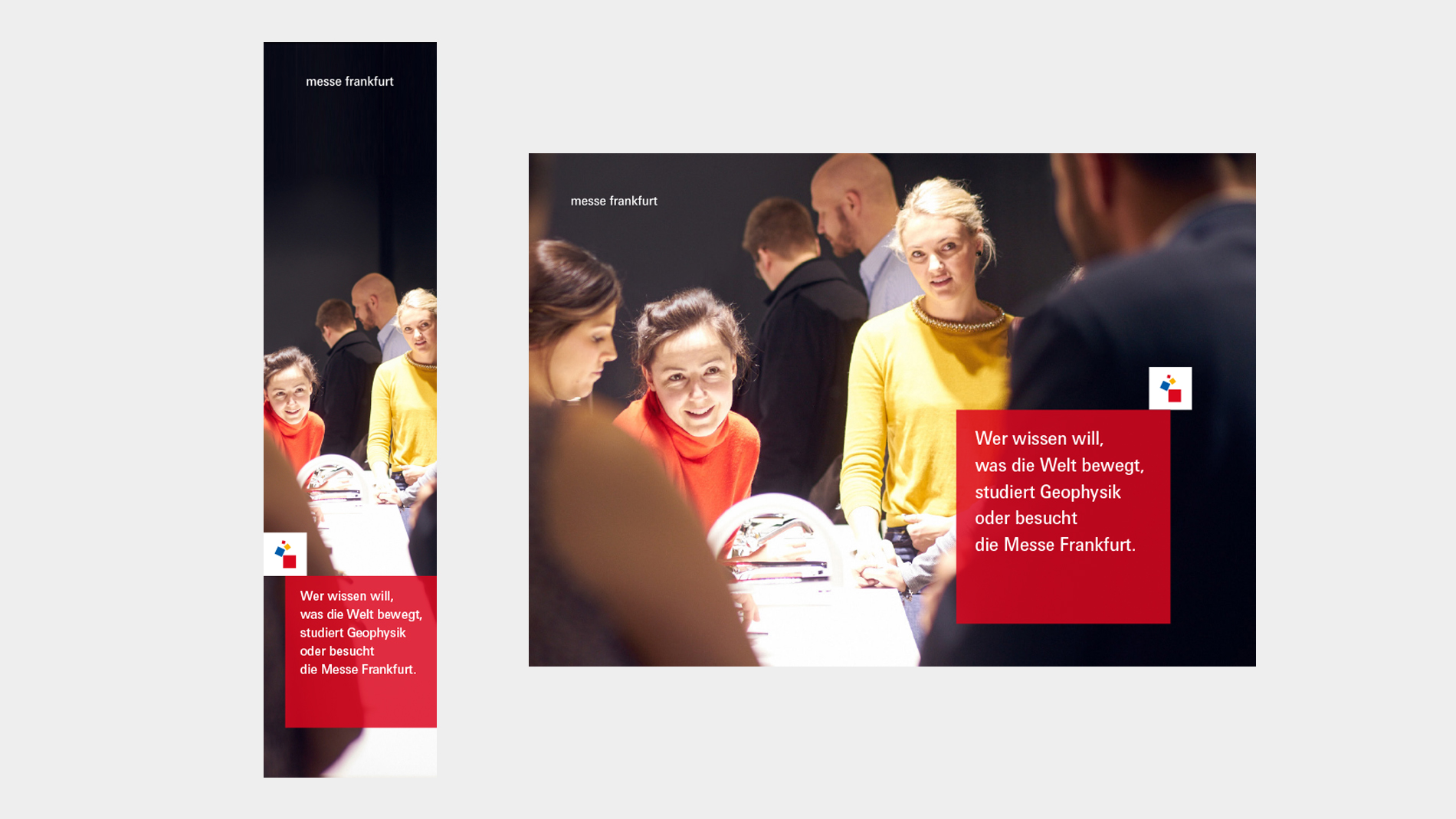
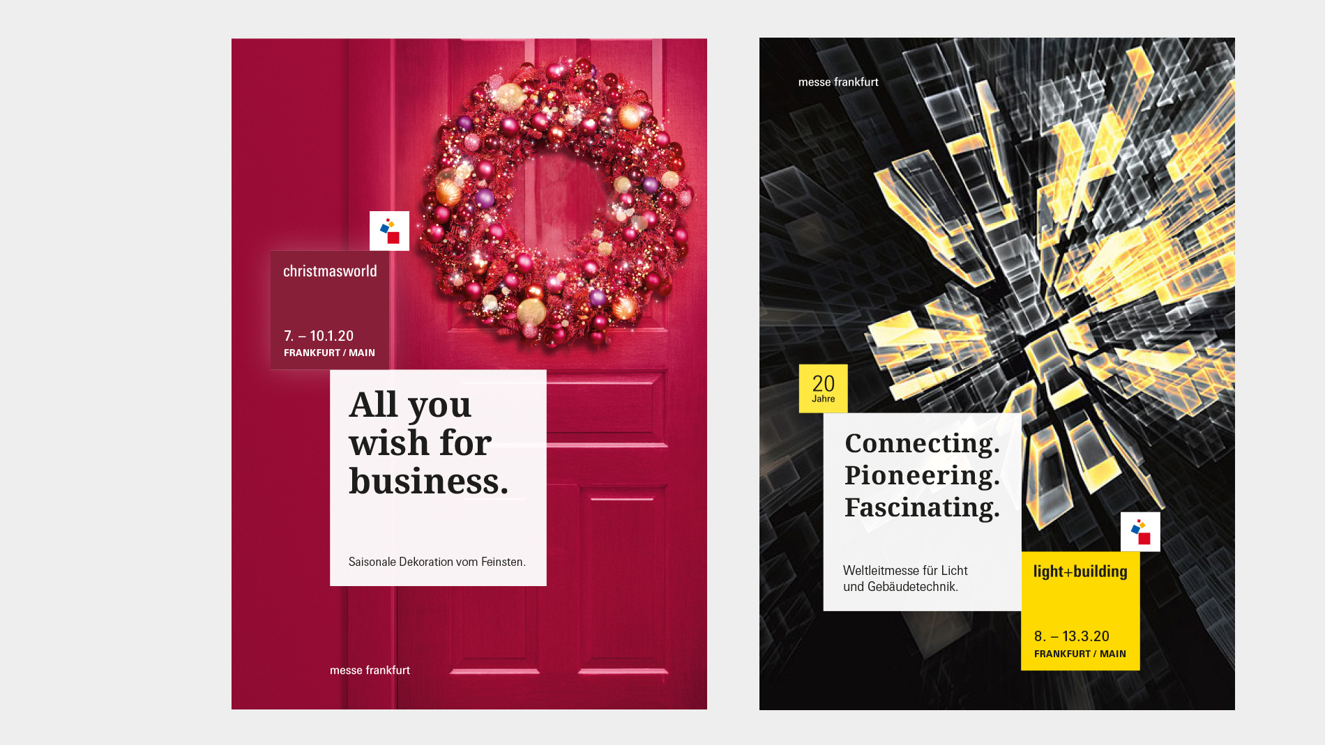
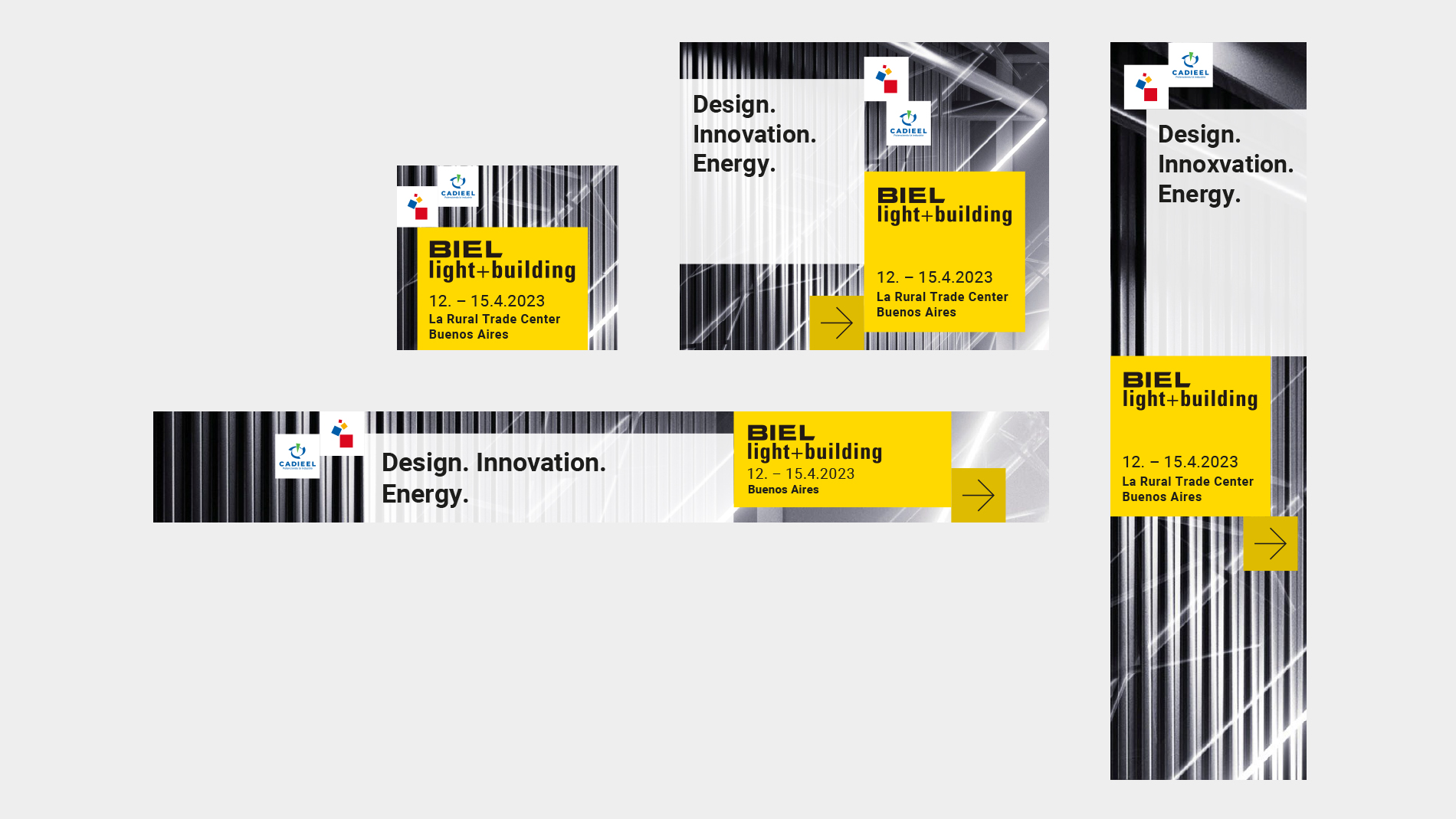
Our design principle is based on the proportions of the symbol, which has been known for decades and is highly popular with Messe Frankfurt employees. The so-called cubes contain all relevant information elements for our umbrella brand and event communications – the system for defining their use forms the basis of the unique visual identity and thus their implementation.
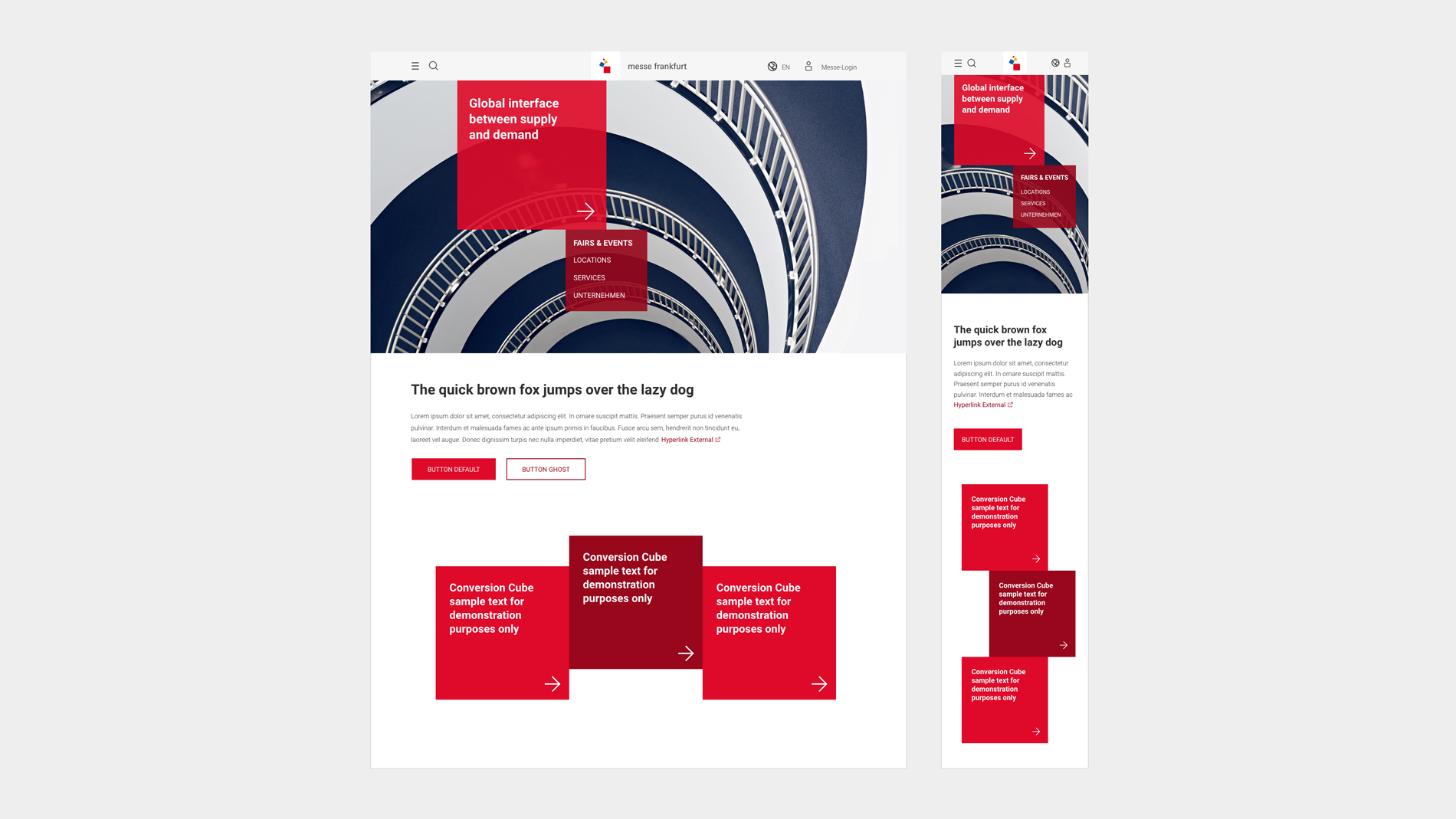
The idea behind the cube system can be summarised in five principles:
- DNA: Messe Frankfurt’s corporate design is based on a system of Brand Cubes derived from the elements of the symbol.
- Function: Within the cube system, each cube has a defined function. All relevant information for visual communication is placed in Brand Cubes.
- Encounters: The Brand Cubes stand for encounters and therefore always occur in a combination of at least two elements.
- Flexibility: In the way they can be combined and rearranged, the Brand Cubes form a flexible system for structuring contents.
- Hierarchy: Different colours, typefaces and defined proportions determine the information hierarchies.