The most important information always to hand
Whenever Messe Frankfurt communicates its own services, guidelines, tariffs etc., the respective brochures are published by the umbrella brand as sender. This also applies to the communication of services related to events. When it comes to marketing, the aim is to increase focus on the services of Messe Frankfurt offered at the specific location in order to strengthen the umbrella brand.
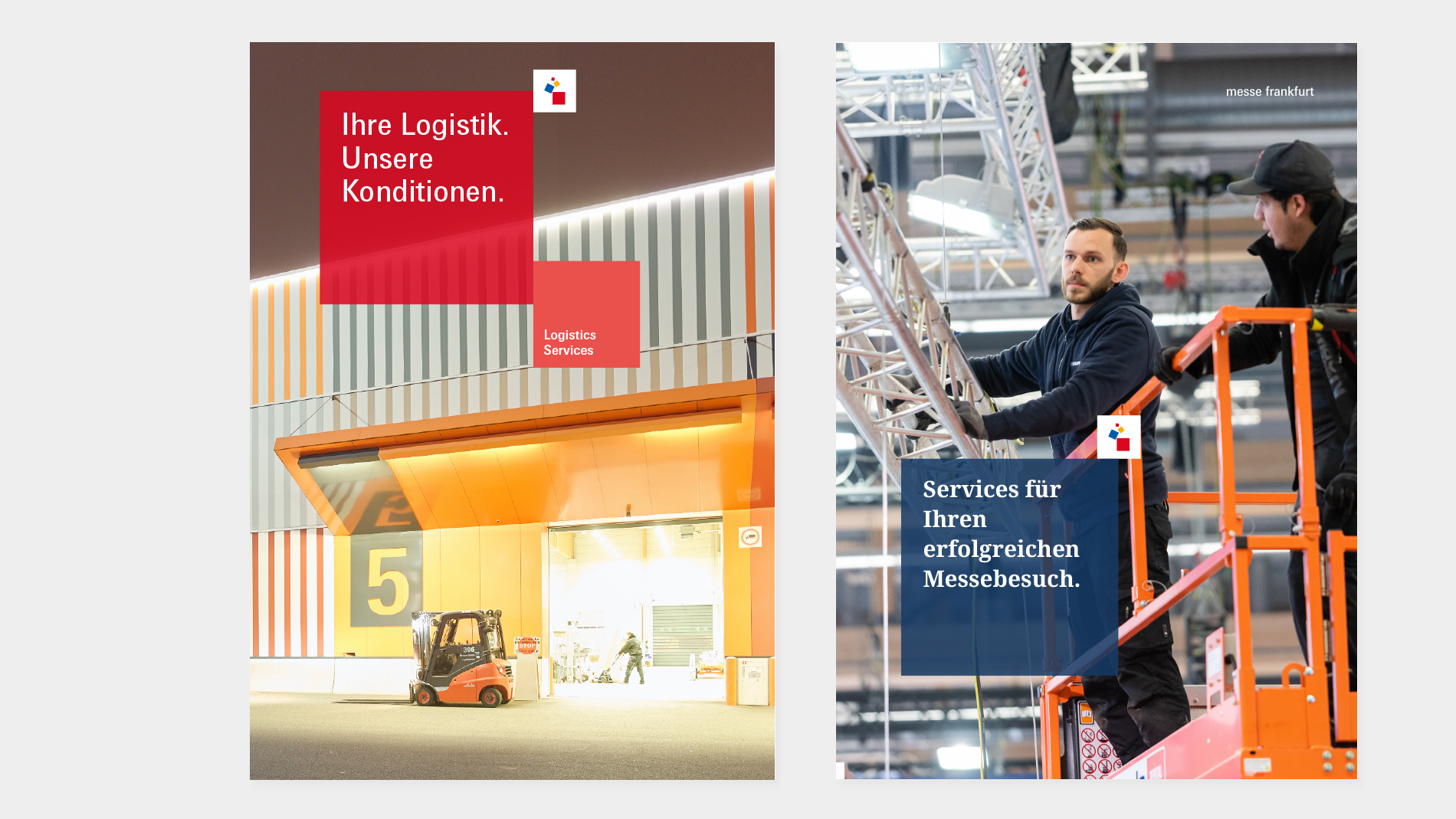
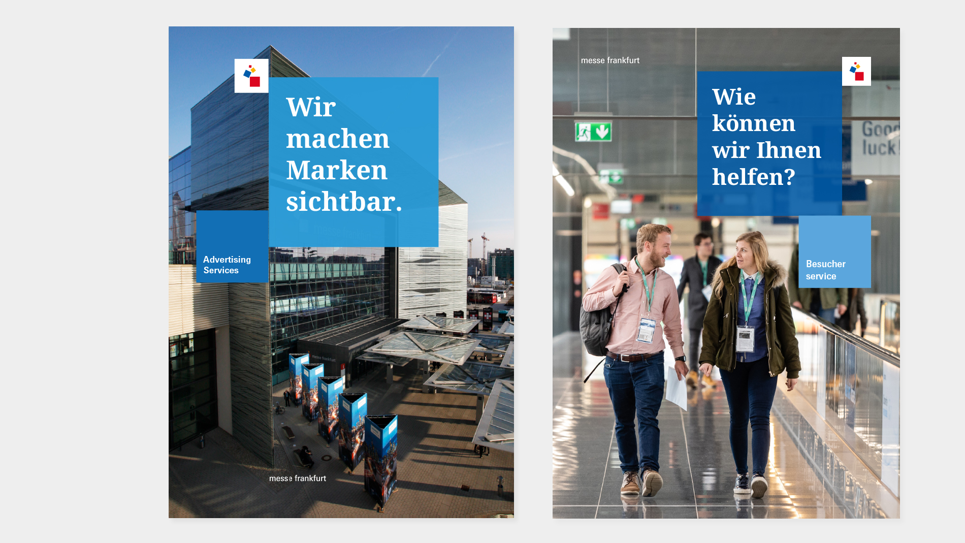
On the cover of these brochures, the cover image represents the publishing area (Technical Event Management, Logistics Services, Traffic Management, etc.). The cover image is the same for all events and can be changed at given intervals, e.g. each year.
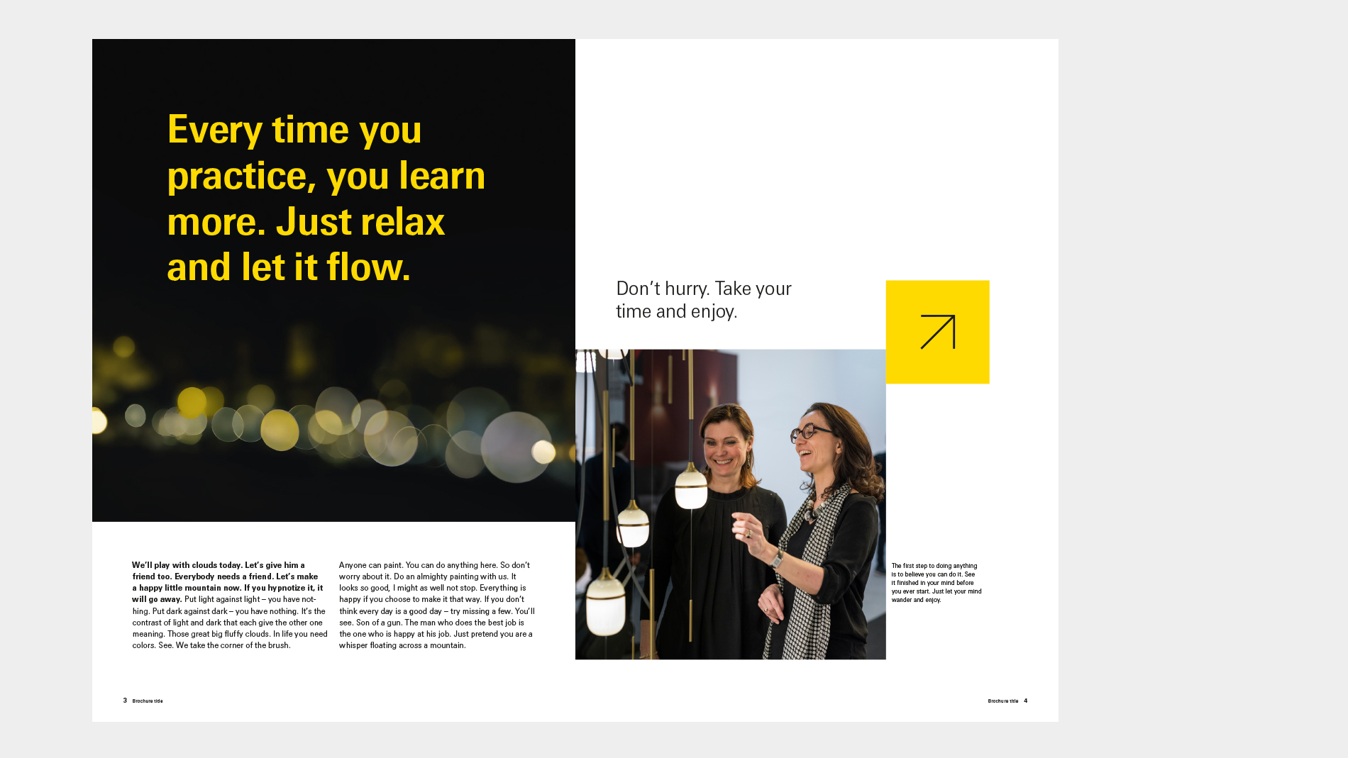
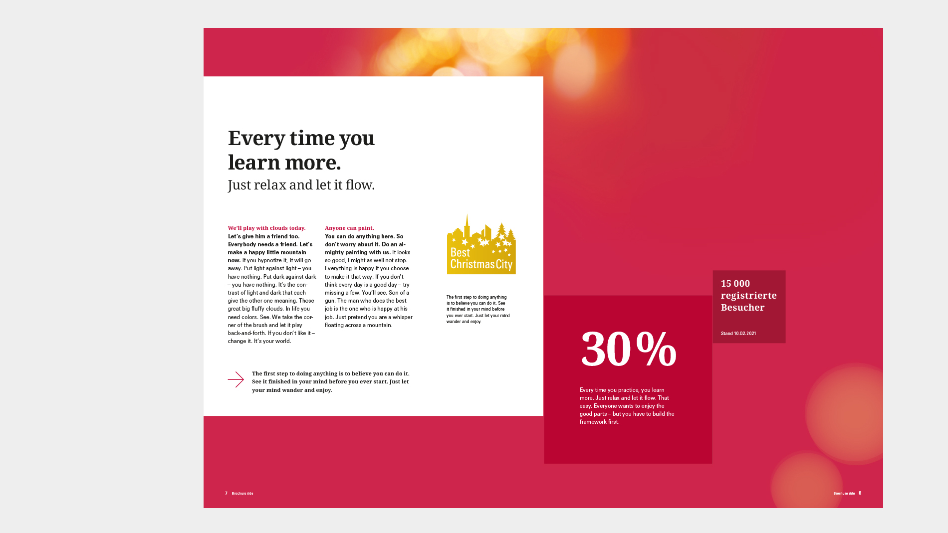
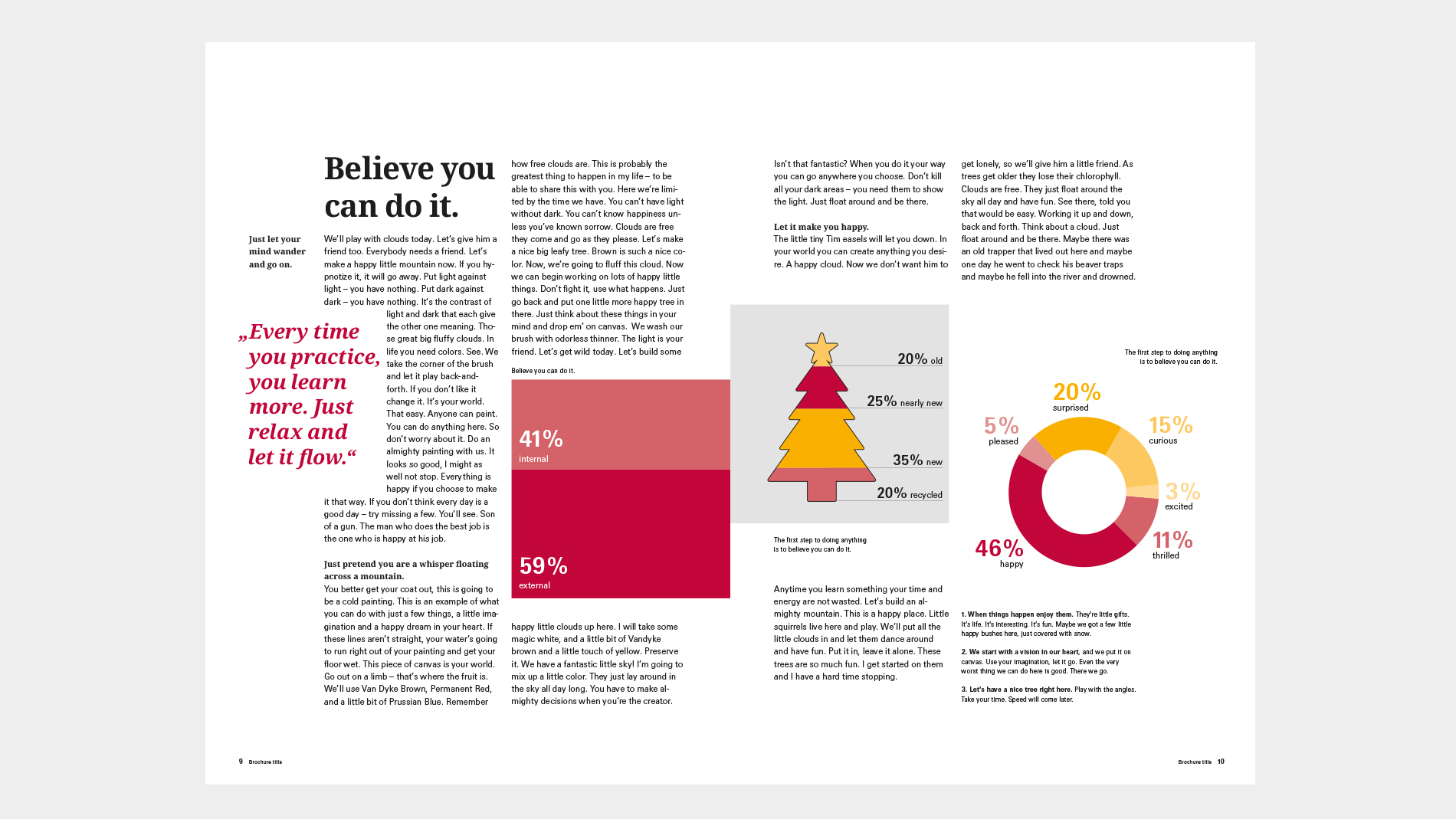
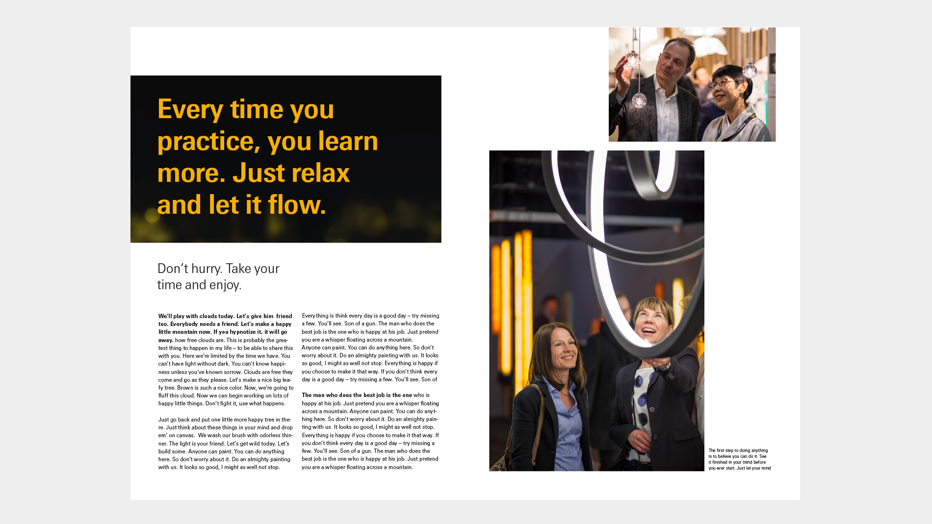
For the layout of inside pages, the cube system can be interpreted more freely.
Typesetting: text can be aligned using ragged right, shape setting and full justification.
Essentials
- On cover pages: the cube system is applied on a full-area background image.
- At least two cubes: Corporate Cube and Communication Cube (with the key message), possibly plus an Additional Cube (for supplementary information)
- Colour of Communication Cube: primary or secondary colours with a slight translucency (we recommend 85%; with very “busy” visuals, reduce the translucency; with “calm” visuals increase accordingly)
- The Messe Frankfurt logotype is separated from the symbol and is aligned with one of the image or text axes. It can be positioned freely. Used in white/black/MF dark grey, depending on visual (print files in corporate brand logo box)
- On both front and inside pages: all cubes touch on one side, offset by at least half a grid unit. Cubes may have one side at maximum in the bleed; they may not be placed in the format corners.
- Cubes are not flush with each other and may not be placed corner to corner, but are always offset.
- Typeface: Messe Univers (see template for examples)
Options
- On cover pages: Additional Cube for supplementary information such as identification of the issuing division (Technical Traffic Management)
- Size of Additional Cube: smaller than Communication Cube
- Colour of Additional Cube: freely selectable from the primary or secondary colours defined for the company; without translucency, if possible to harmonise with the key visual and the function of the cube. Depending on the colour of the cube, the contents are in white or black on the background.
- Type sizes variable (see template for recommendations)
- On inside pages: freer interpretation for example also allows white cubes, cubes created using shape setting in the text, contourless or single cubes, cubes in the form of photos, infographics, illustrations or similar (see sample pages in the slider)
- Images can be created as squares, but do not necessarily have to be.
- Important: cubes should not be used too excessively.
- A maximum of five “design” cubes are used on one double page; single cubes are also possible.
Download
- Corporate Brand Brochure Template (zip, 887 KB)
